Modern Realty — Visual Identity Case Study
Modern Realty is a contemporary real-estate brand built for a new generation of buyers who value clarity, trust, and long-term confidence over hype and urgency.
Our role was to design a complete visual identity system that could:
Differentiate Modern Realty in a crowded market
Feel modern without chasing trends
Scale consistently across digital and physical touchpoints
Scope:
Brand identity.
The real-estate category suffers from three major branding issues:
Visual noise
Many brands rely on loud colours, generic photography, and overly decorative elements.Lack of consistency
Logos and visuals often break down across social media, signage, and print.Short-term thinking
Trend-driven identities age quickly and lose credibility over time.
Modern Realty required an identity that reassured at every touchpoint, guiding clients seamlessly through the daunting process of finding the right home.
The Problem
The Strategic Solution
Noise
to Signal
How we approached the problem
We positioned the brand around one guiding principle:
Clarity over complexity
Instead of designing a “marketing look,” we built an identity system that behaves like architecture:
Structured
Balanced
Calm
Purposeful
Every visual decision was measured against one question:
Does this increase trust and long-term usability?
Logo & Graphic System
How the identity was built
The logo was designed as a modular system, not a static mark.
What we did:
Constructed the logo using clear geometric logic
Designed multiple logo configurations (vertical, horizontal, symbol-only)
Extended the logo into a repeatable graphic pattern system
Why it works:
The brand remains recognisable at any scale
Graphic elements feel native, not decorative
Patterns add texture without visual clutter
This allows Modern Realty to express itself flexibly while staying consistent.
Colour & Typography
How we created a calm, credible look
Colour system
Deep green tones for trust and stability
Soft neutrals for clarity and space
Warm accent colours for approachability
Typography system
Editorial serif for authority and confidence
Clean sans-serif for readability and function
Script used sparingly for human emphasis
Result:
A visual tone that feels established, modern, and composed — not promotional.
Photography &
Visual Language
How imagery supports the brand
Rather than relying on generic property imagery, we defined a clear photography direction:
Principles:
Real environments over staged perfection
Natural light and architectural clarity
Lifestyle moments that feel lived-in
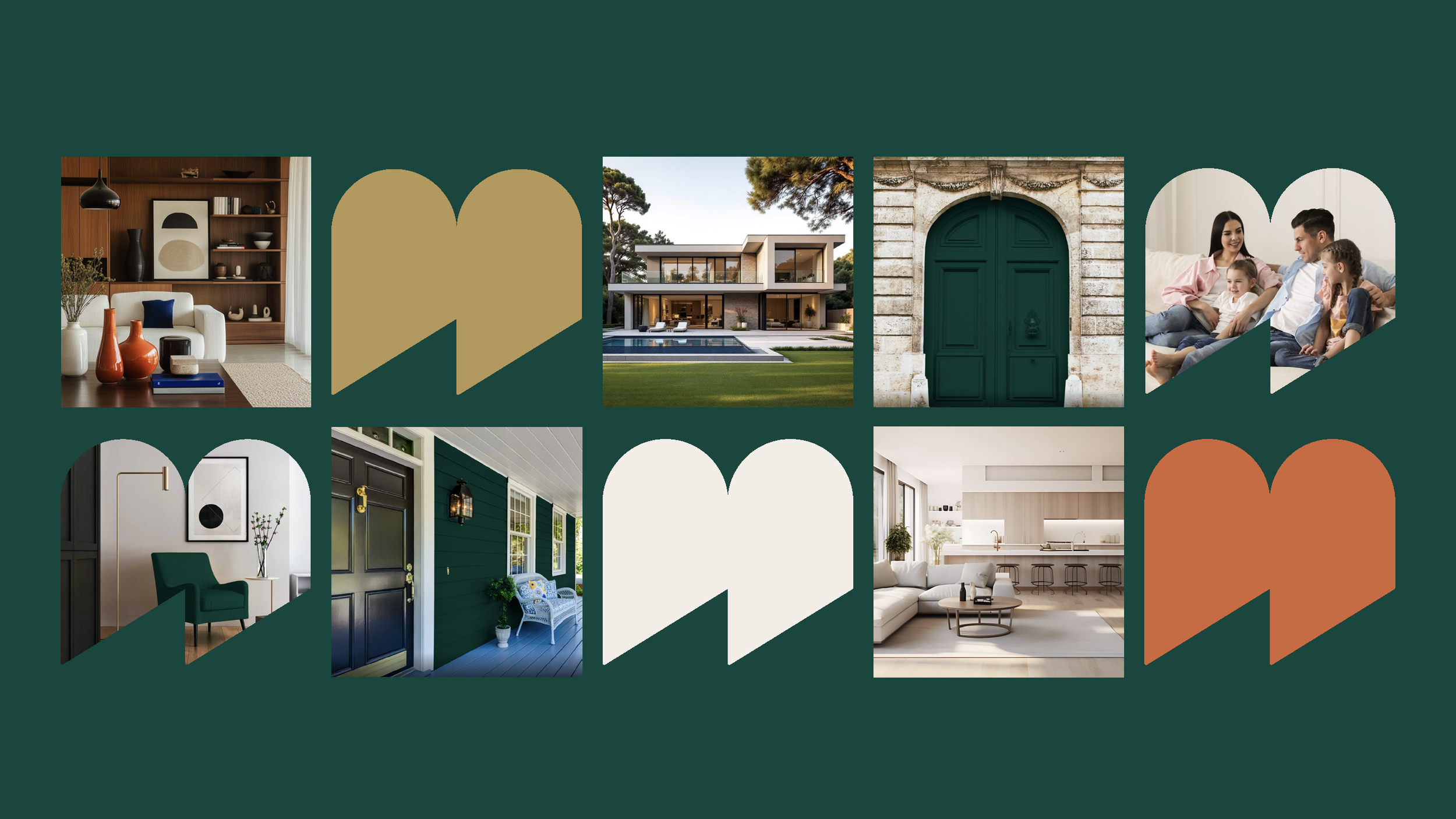
The logo mark is used as a masking and framing device, creating a consistent visual lens across imagery.
This ensures all visuals feel unmistakably Modern Realty — even without text.
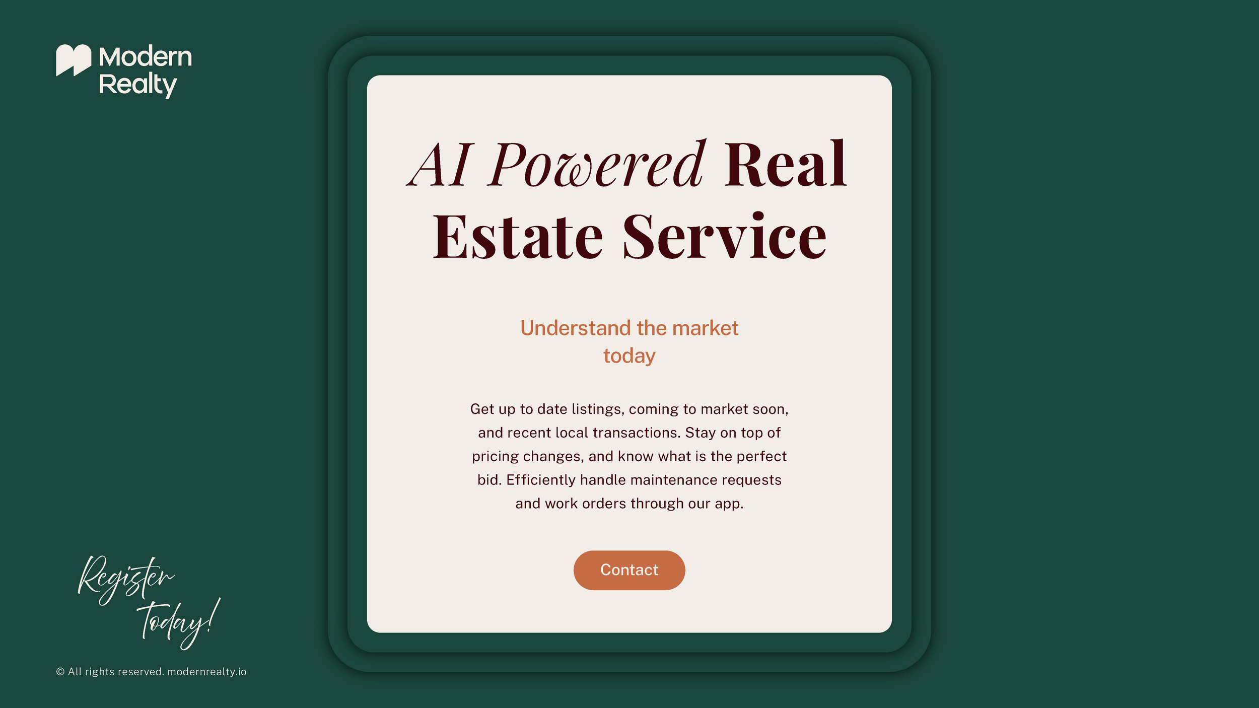
Real-World Applications
How the system performs in practice
The identity was designed to work seamlessly across:
Social media
Physical signage
Printed materials
Brand merchandise
Each application maintains:
Strong contrast and legibility
Consistent spacing and proportions
Clear brand recognition
This proves the system is not just attractive — it’s operationally strong.
Outcome
What was achieved
The final result is a future-proof visual identity that:
Differentiates Modern Realty in a saturated market
Builds trust through restraint and clarity
Scales effortlessly across platforms
Can evolve without losing its core character
Modern Realty now has a brand foundation that supports long-term growth.
If you're interested in working with us, complete the form with a few details about your project. We'll review your message and get back to you within 48 hours.